Hopper talks about Delightfulness in mobile apps at Dublin Travel Massive
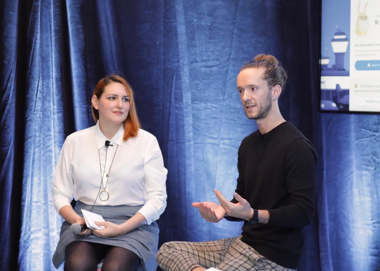
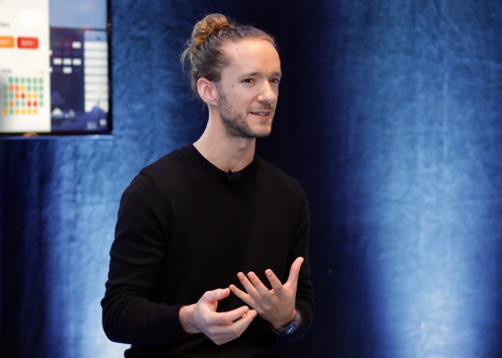
Silvia Amaduzzi, design manager at Travelport, spoke to Pierre-Etienne Corriveau, product design lead at Hopper (based in Montreal) about the “hopper way” — a set of design principles that empowers everyone at Hopper to design great experiences.
![]() This recap is written by Kevin O’Shaughnessy, Dublin Travel Massive leader, and co-founder of CityHook — a travel platform for airport connections.
This recap is written by Kevin O’Shaughnessy, Dublin Travel Massive leader, and co-founder of CityHook — a travel platform for airport connections.
Dublin Travel Massive — in partnership with Deem — hosted an evening event featuring their design heroes at Huckletree on November 7.
🎙 Listen to the live talk on the Travel Massive Podcast — Episode 32
Flight search is as much about managing anxiety as conversion
Flight prices seem to fluctuate wildly from a passenger’s perspective. Anxiety for the booker has now become a regular sentiment when searching for flights, according to Hopper.
Their tools, delivered mobile-only via their app, allow booking passengers to manage this anxiety. They manage this by using a “journey-based” interaction with a user rather than a “session-based” interaction. In simple terms, a search started on a mobile app can, in theory, keep querying while it’s idle in your pocket. Then, whenever the price is “right”, it can notify you and continue the booking process. Conversely, booking on the desktop web is a very transactional in-and-out affair.
They’re confident with their perspective on this: 70% of the time, Hopper tells their users to just “close their app” when they start a new flight search. What happens here is they start monitoring flight prices until the right deal comes up — from time to time they’ll suggest alternative routes close by. A simple notification triggers the user to complete a booking. For alternatives, Hopper says that alternative destinations account for 20% of their bookings.
Watching is the currency of their activity.
From a design perspective, this is very “new” for users and Pec and the team at Hopper work to deliver this articulated in the design of the app: every new user needs to understand that it’s not the regular search app. This action of “watching a trip” is the most important activity in the app. It’s more likely to convert (in the long run) than someone who goes straight to the result list and book.
This gives Hopper a great advantage for booking. It may not suit every itinerary, but “pressing pause” on the interaction while the machines and AI keep on searching for you (Hopper say that its their “bunnies” that do the searching), keeps the dialogue going with users long after they start their search query.
Design principles that can help engineers
There is a “Hopper way”. According to Pec, these guidelines help avoid micro-managing designers, allowing a little more creative freedom.
It also means that engineers and anyone else in the organisation has a north star to help deliver great experiences too.
Often, the relationship between each creative and their artistic director is one element of tension in a software team; tension can then carry between artistic design goals and the engineering team. Silvia has an agile approach to this, which they use at Travelport Digital (make sure to catch her speak on this sometime) and it looks like “being agile” (small/short and quick) is the key at Hopper too.
An element that simplifies the task of delivering Hopper is their focus on being mobile-only. When looking back on previous parts of his career, Pec noted that adding a mobile strategy typically doubled the platforms that a travel brand would have to work with: traditional desktop web and mobile web are two unique experiences; adding iOS and Android makes four.
It would also suggest that even “responsive web” is merely a technological approach to help deliver web. Add on mobile apps and there’s suddenly four platforms to master. Hopper’s design team don’t fuss over web users; it’s not their focus.
Delight at scale
A key element for Hopper is how they delight their users. The whimsical bunny-rabbit has become a mainstay of their design language. Other animals may feature elsewhere in the app too. While a bunny may not be to everyone’s taste, the ability to introduce new “delightfulness” to the app is one of the magical aspects of how Hopper works as a team.
Their process is relatively straightforward: the main difference is that their design is in-house and long-term. Labs will test some features using industry-standard prototyping tools like Flinto and Framer. When the app is out in the wild, the data science team will work with designers to share notes on how new features are doing. It’s a solid blend of qualitative vs quantitative approaches to testing.
Sometimes “standard language” elements from mobile apps like “tab bars” end up getting out-dated or simply eliminated. This tab-bar example is quite common across the bottom on many app screens. Pec points out that a trend is emerging industry-wide to simplify one-task-per-screen, eliminating the need for this “visual noise”.
We’ll see less and less of this “noise” in other apps as time goes on.
Hopper studies and experiments with trends such as these in their lab environment and in production. In more travel-oriented experiments, they avoid “default” features that we see everywhere such as “filters”, instead opting to study why filters are used by passengers in the first place.
We often see a mission-control level of detail in these features; Hopper is inclined to take a step back, observe that — for example — the user is using the filters section to reduce the number of stops. The team will then iterate on a number of alternatives to get the same job done. In PC language, why fish around in the menu bar when you can just right-click, right?
The best advice for a designer?
Silvia wrapped up with a question to Pec: what’s the best advice you’ve received as a designer. A few came to mind.
- Don’t over complicate things
- Choose your battles
- If in doubt, just ship it: be biased for action
I must admit I’m a fan of the quippy “be biased for action”. Pec elaborated on this a little: The best way to validate something is to ship it and test it, not to over-think it. Ship fast, learn fast.
Highlight video and Travel Massive Podcast
Watch the recap video below —
Listen to the podcast —
Special thanks…
Thanks to Deem (a travel technology company based in California who have just opened a new development center in Dublin) for sponsoring and making this event possible, and their CEO John Rizzo for attending.
.jpg)
Event produced by the Dublin Travel Massive team, Kevin O’Shaughnessy of CityHook and Mark Lenahan of Travelport Digital with support from Amanda Campbell of Farelogix and Tahnee Perry of Deem.
Thanks to Michael Collins and Niamh Waters of TravelMedia for event support. Photography by Rafal Kostrzewa. Recap video by Leslie Graham.
And of course the Dublin Travel Massive community, for attending!
Connect with the Dublin Travel Massive and be a part of the community.
👋 This article is archived. Take a look at our new website.